Reach is a playful, community-driven bartering app designed to make mutual aid easier, friendlier, and more accessible. Born from economic instability, social isolation, and the rising costs of everyday life, Reach connects neighbors, builds resilience, and fosters genuine human connection through skill-sharing and support.

At its core, Reach is about lowering the emotional barrier to asking for help. It’s not trying to reinvent community; it’s trying to make it easier to access. Reach reminds people that mutual aid doesn’t have to be revolutionary to be real. Borrowing sugar used to be normal. Support shouldn’t take weeks, forms, or fees. 
The app experience brings the brand to life with bold UI, punchy language, and clear actions. From the start, users are prompted to give, trade, or ask for help—removing the awkwardness of participation. Loud color blocking, oversized type, and irreverent phrasing guide users through the platform with personality and purpose. The design reinforces Reach’s core belief: that helping each other shouldn’t require permission, polish, or perfection
Marketing Approach
Out-of-home placements act as a first introduction, designed to catch attention through ambiguity. Encouraging moments of “What am I looking at?” becomes a tool for engagement.
Visually, Reach leans into deliberate confusion to spark curiosity. The brand uses unexpected juxtapositions and oversized elements to stand out—especially in fast-moving, ad-saturated environments. Out-of-home placements act as a first introduction, relying on intrigue rather than explanation. Reach invites people to rethink value, reciprocity, and the ways we ask for or offer help.
This tension invites a second look, blending humor and sincerity to spark curiosity around the possibilities of mutual aid.​​​​​​​
The marketing invites people into a shared joke about how flexible human value systems can be. That moment of curiosity becomes the hook for something deeper: a platform where support, care, and community are free to be offbeat, warm, and mutual.
The Identity
Reach’s visual identity draws from the scrappy, self-made energy of 1990s public access TV, the blunt clarity of public service announcements, and the chaotic urgency of late-night infomercials. Each reference point reflects a different form of DIY communication: low-budget, community-driven, and designed to reach as many people as possible without gatekeeping.
Public access TV gave everyday people a platform to share information and support each other—often with nothing but a green screen and something to say. PSAs delivered what you needed to know, fast. That mix of sincerity, boldness, and slightly unhinged optimism aligns with the spirit of mutual aid and bartering: imperfect, resourceful, and rooted in trust.

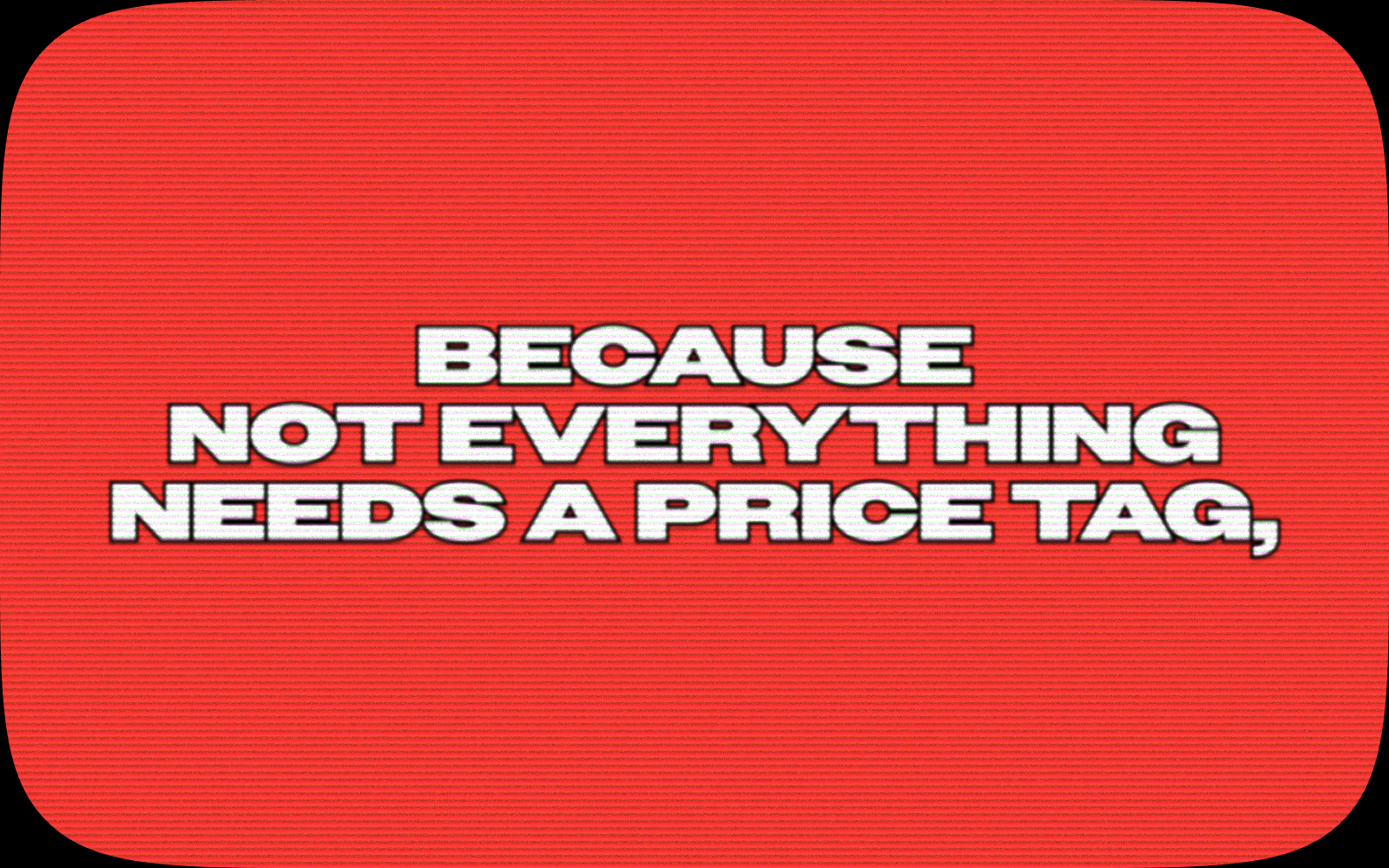
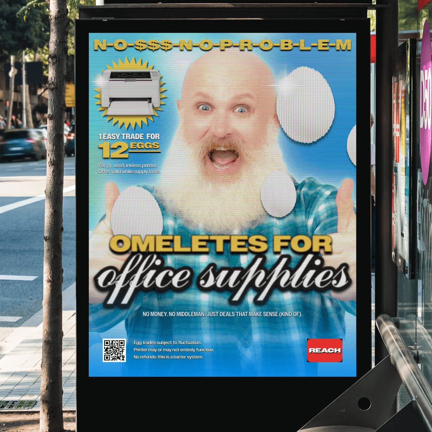
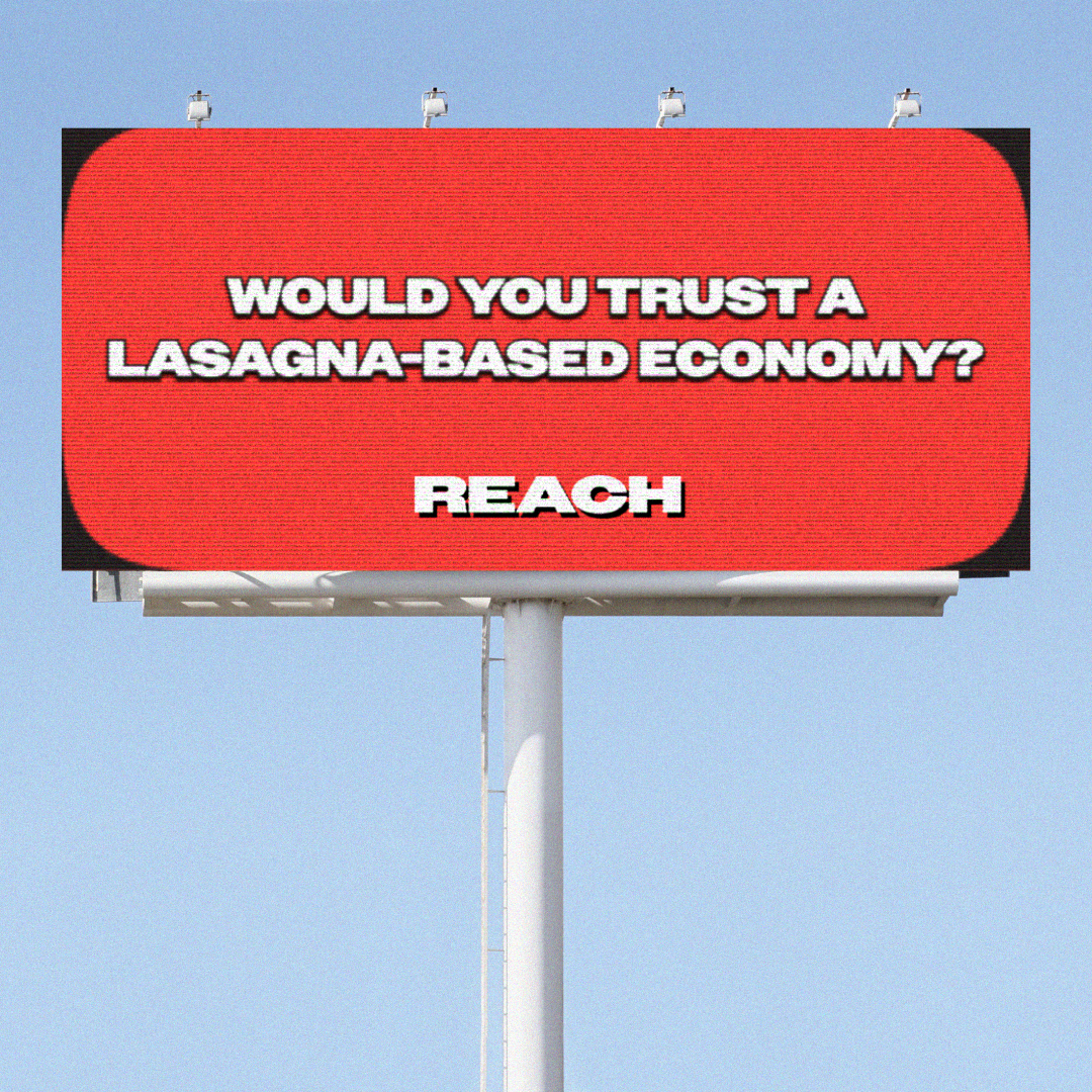
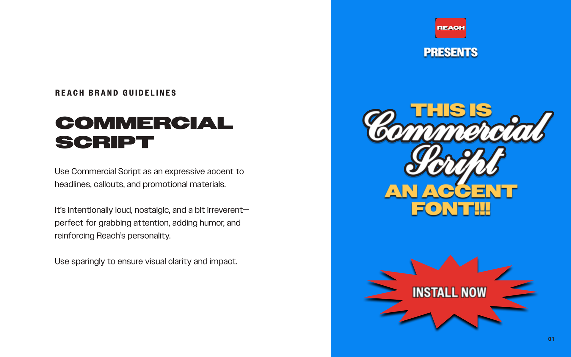
Infomercials made the absurd feel practical, convincing you that a weird little gadget might actually change your life. Commercial Script taps into that same nostalgic, loud energy to support Reach’s playful, attention-grabbing tone.

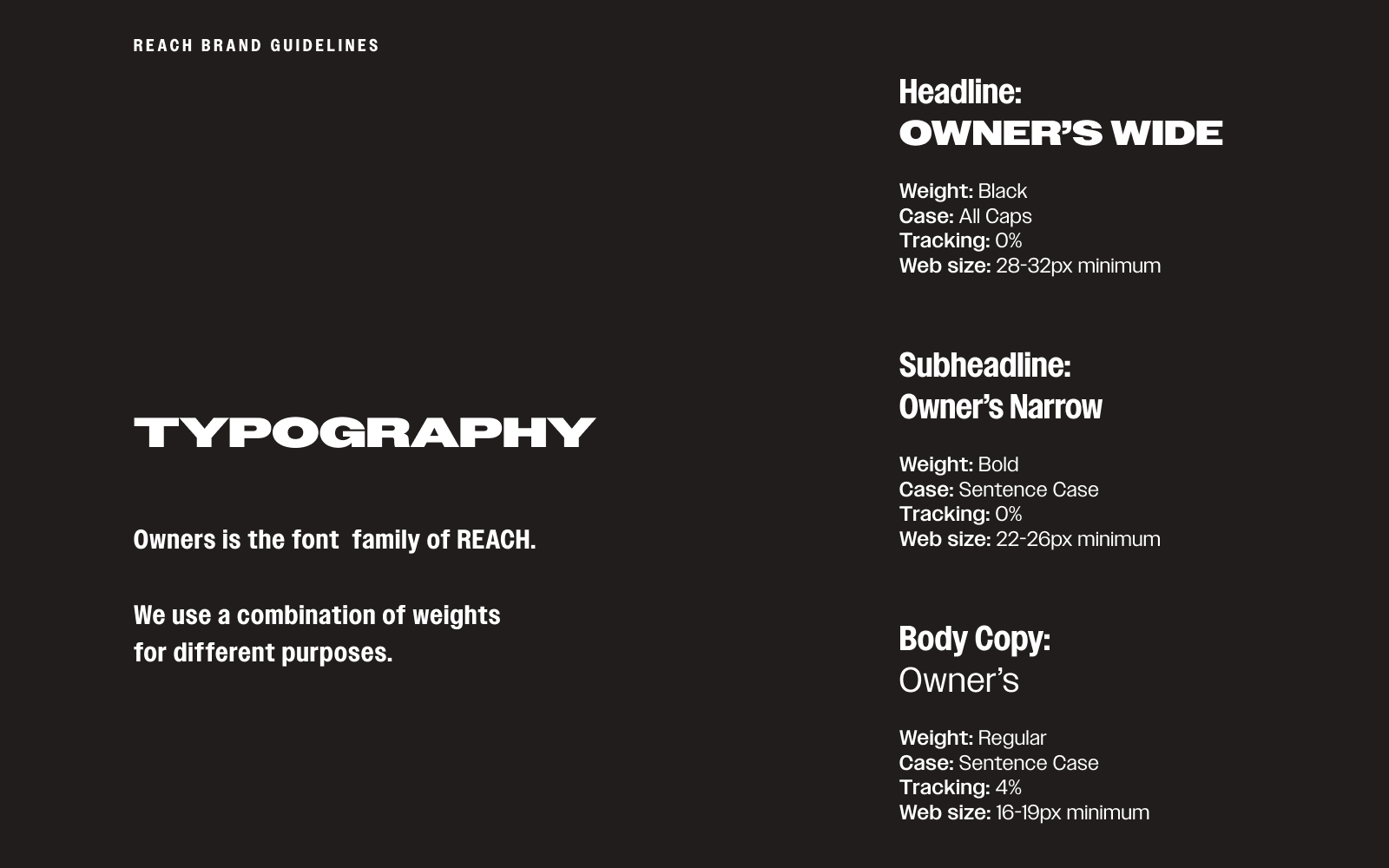
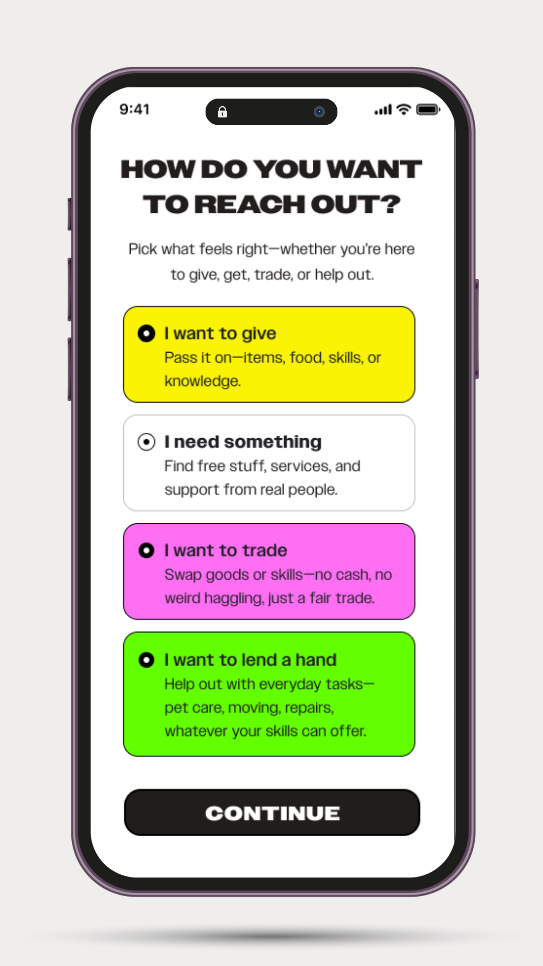
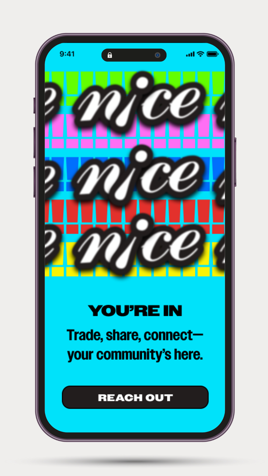
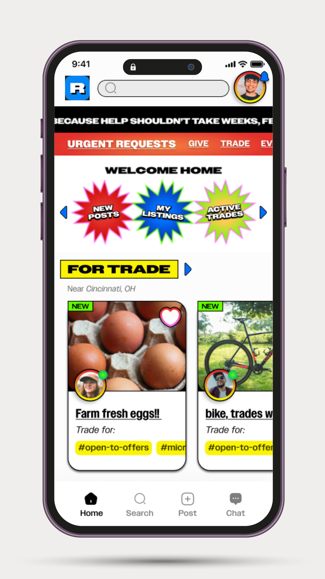
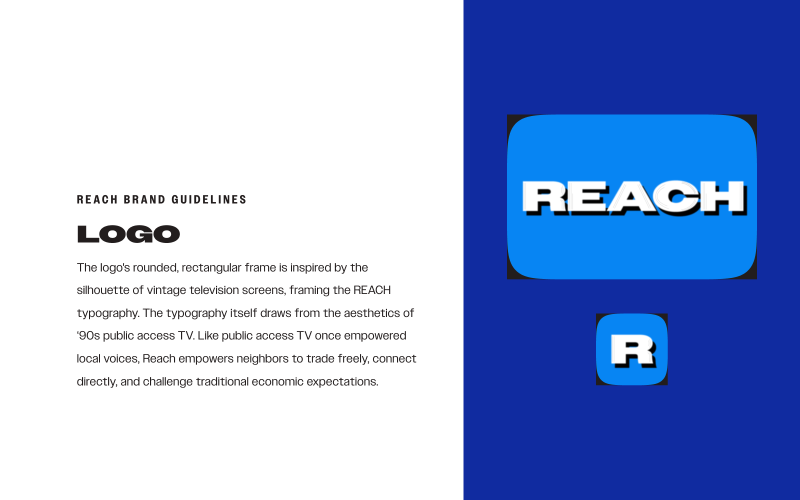
Typography is anchored by the Owner font family, used across weights and widths to create hierarchy and tonal flexibility. From bold, wide headlines to narrow subheads and legible body text, each style was selected for clarity, contrast, and impact—supporting a visual system that’s accessible, expressive, and direct.

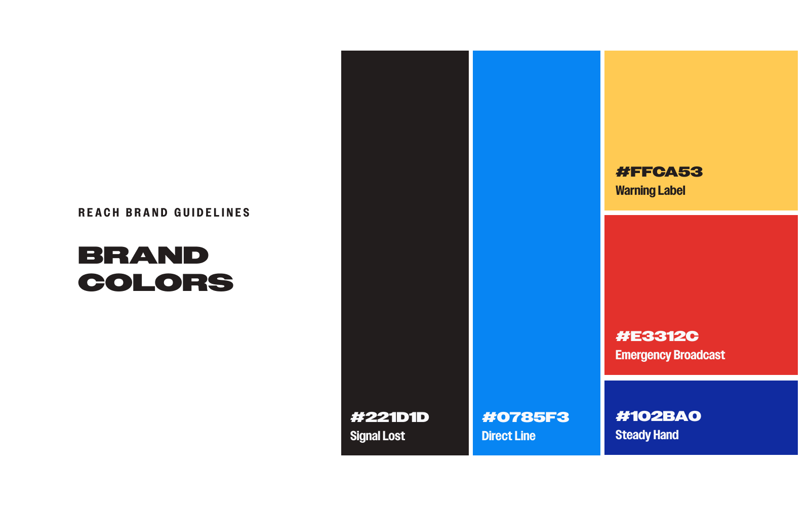
The color system draws from visual references associated with urgency, clarity, and analog communication. Inspired by elements like warning signage and emergency broadcasts, each hue was selected to convey immediacy and approachability with a retro undertone. The palette’s naming conventions—Signal Lost, Emergency Broadcast, Warning Label, Direct Line, and Steady Hand—reinforce the brand’s utility-focused identity while adding a layer of expressive, functional character.


This self-initiated conceptual project was created to imagine how a platform like Reach could look, feel, and function if built in the real world. Every element is speculative, designed to explore what a more accessible, barter-based system of mutual aid might make possible.

SEE MORE THINGS

Back to Top